I am not a purple person. For some reason, I’ve just never been a fan of the colour. Over the years, I have incorporated it into my wardrobe a bit more, but so far there is no purple in my decor.
At the beginning of December, Pantone announced its colour of the year for 2014: Radiant Orchid. According to Pantone, “It is an expressive, creative and embracing purple—one that draws you in with its beguiling charm.”

Despite all of the glowing language Pantone used in its announcement, I don’t think I’m going to be joining the purple party.
On the fabric shopping trip when I found my beautiful ottoman fabric, I found a bolt of heavyweight upholstery fabric on deep discount. It was purple.
I bought a couple of yards, thinking I could sew some throw pillows for the basement couch and add a new colour into the mix. I’ve since found pillow forms, piping and even zippers. However, I think this project is destined to remain a UFO (unfinished object).
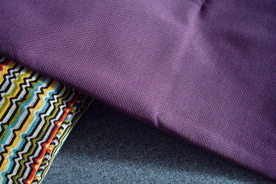
When I laid the fabric on the couch downstairs with the other pillows, the purple didn’t pop the way I thought it would–although it’s not looking too bad in this photo.
The few times I’ve pulled out the fabric to start sewing, I fold it up and put it away again. The purple is just not speaking to me.
While radiant orchid may be “intriguing” and “captivating,” I am neither intrigued nor capitivated by purple, and I don’t think Pantone’s endorsement is going to change that.
Do you have a colour that just doesn’t do it for you? How do you feel about Radiant Orchid? Do you like purple?

I agree about that fabric not popping. It seems to be a light-sucking fabric rather than light-emitting, if that makes any sense? Not sure if it’s the fabric or the colour.
I have numerous colours that don’t really do it for me. One of them is salmon. There are several shades of pink that I find quite putrid (think pepto-bismal…) I’m not a big fan of pastels, preferring either vivid hues or ice tones (mostly white with a hint of colour.) I like colours to have a sense of clarity and transparency. Then they please my eye the most.
I say, if it doesn’t do it for you, follow your instincts! Make some barn towels out of it, or something. 🙂
Barn towels! I don’t think I dislike it enough for that.
I don’t know, it might make a nice pop of colour in there! 😀
It would definitely pop out there. It’s all earth tones… wood, dirt, straw, manure… No purple.
I love purple! My glasses are purple and I find they look good with many colors. However, I agree that your purple fabric does not go with your other pillows.
Can I make you some purple pillows?
No thanks but you could make me a purple dress! LOL
An excuse for more fabric shopping. Excellent!
I actually like purple, but agree it doesn’t go with your other pillows. I don’t think there are many colours I don’t like, but I can say I am not a fan of the colours that look dusty or dirty. You know the pink that is a dusty colour? Looks dirty to me. Of course, my favourite is turquoise and am trying to incorporate more of it in the house. except thekids rooms. Piper has a lot of bright pinks, purples, oranges etc. While cooper is gray, light blue, ans bright orange.
Ahhh, dusty rose. Wasn’t that an 80s classic?
Yeah, and I think it made a comeback a few years ago….I remember walking into some clothing stores and thinking “why does everything look so dirty? Where are all the fresh, bright colours?”.
Dusty rose was the colour scheme of my first wedding. Now I think that’s an indication of just how far away from my true self I actually was at the time!