Call it fall. Call it time for some changes. Call it Friday night on Instagram. Whatever it was, three pictures in one scroll had me thinking about adding some olive accents to our navy blue bedroom.
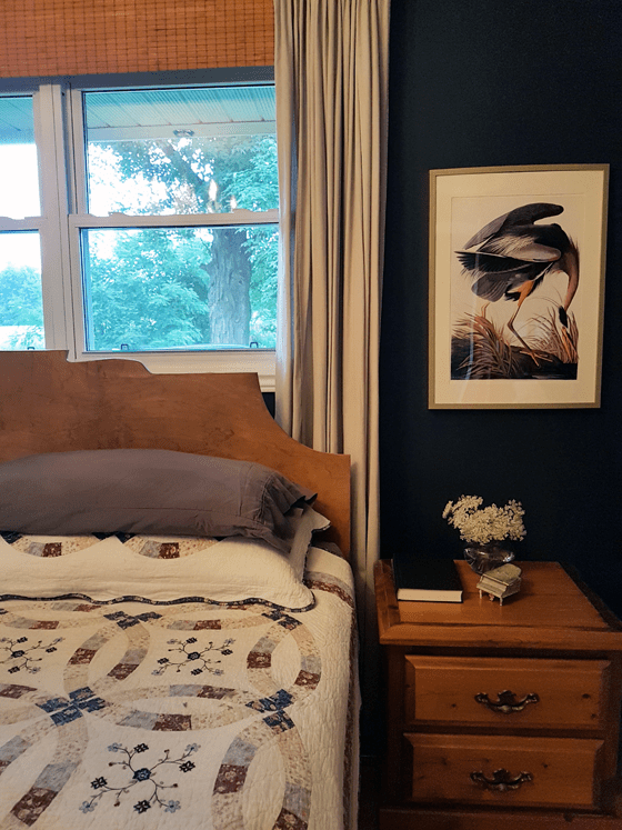
I still love the Hale Navy colour that we painted on the walls–and so does the rest of the world apparently, as the Hale Navy trend is still going strong.
I’ve not made many changes to the room since our One Room Challenge Reveal. I feel like a touch of olive would freshen things up–and would be timely for fall.
The bedding would be the easiest. New sheets. New comforter or shams. But what about an upholstered headboard? Velvet and tufted like that first photo from barlow reid? Hmmm… might be a bit more than I’m looking to tackle right now… but tempting.
(BTW, the new season of the ORC starts this week. You can follow all of the action on www.oneroomchallenge.com.)
What colour combos are you liking these days? Do the seasons inspire anyone else to redecorate? How long do you live with a “done” room until you feel the need to do it again?

That tufted footstool is gorgeous!! I do love that colour combination. The whole white wall/vivid or dark colour thing just isn’t going away for me. I don’t know how long I live with a “done” room before it’s not anymore. I haven’t often had the opportunity to find out. 😉 But I think what I love is a room where the basics are mostly neutral and beautifully finished, so the look can be changed by changing accessories. Your guest room is beautiful, as always. I think some green would be pretty and refreshing.
The neutral with fresh accessories or accents is a tried and true. I think I’m realizing that even in colourful rooms (or with coloured paint) you can still shake things up. There are so many options for beautiful colour combinations.
I really like that color combo but had never really thought to put them together!
Our kitchen is a deep dark red that I love but usually in the spring it get the itch to paint it something light and airy. So far I’ve held strong and left it red. 😁
I understand. Sometimes I think it’s easier to get tired of stronger colours, like the navy in our bedroom. I always wanted a red room, and in our first house we had a red dining room. It lasted for 5 years, but I confess I was tired of such a strong colour by the time we moved.
I think the navy, while dark, is considered more of a neutral than a red or burgundy. I think that green wall, above, may be as well. Maybe because they are so dark they’re close to black? I don’t know what the difference is, perhaps the energy level of the colours. Reds, purples and royal blues seem to demand attention and I need them in smaller doses. That’s purely a personal choice; many people thrive in super energetic rooms.